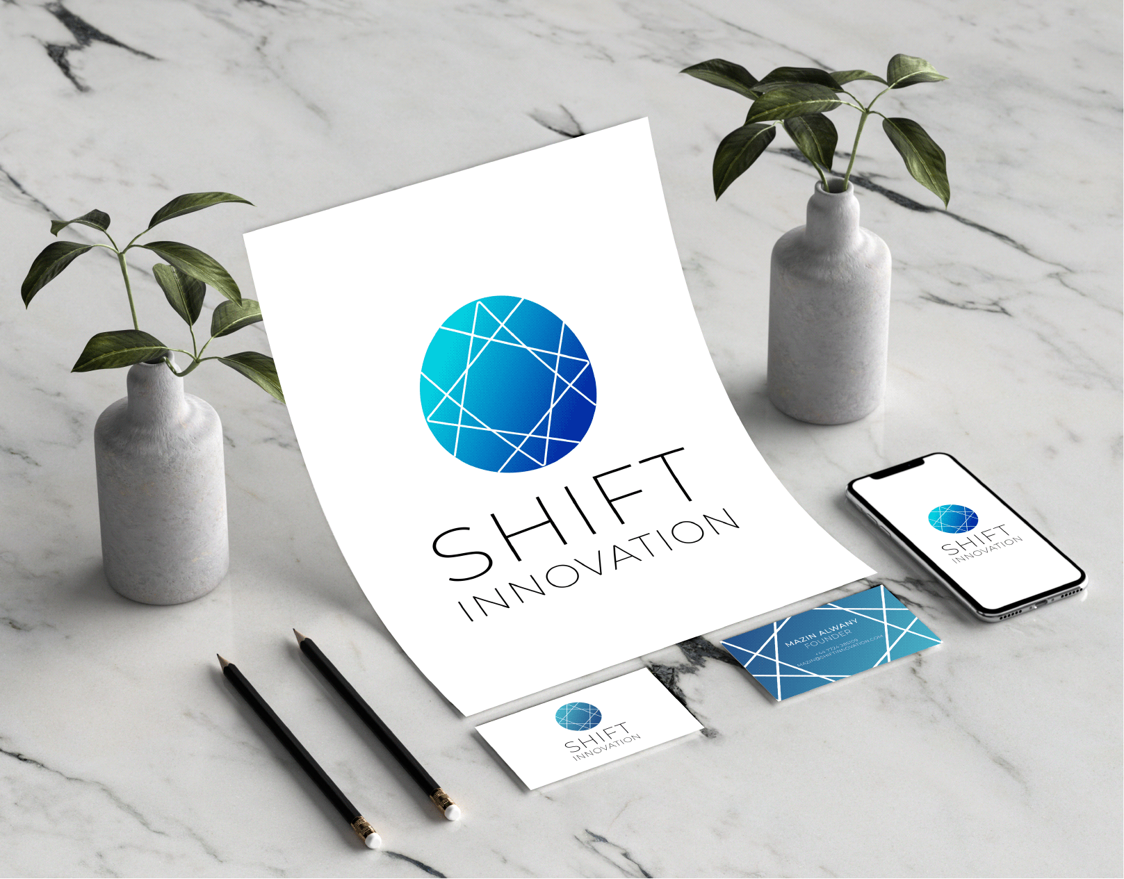
Branding Project: Shift Innovation
Providing academic and professional training and development courses and designing syllabuses
Mazin Alalwany
Founder, Shift Innovation
May 2019
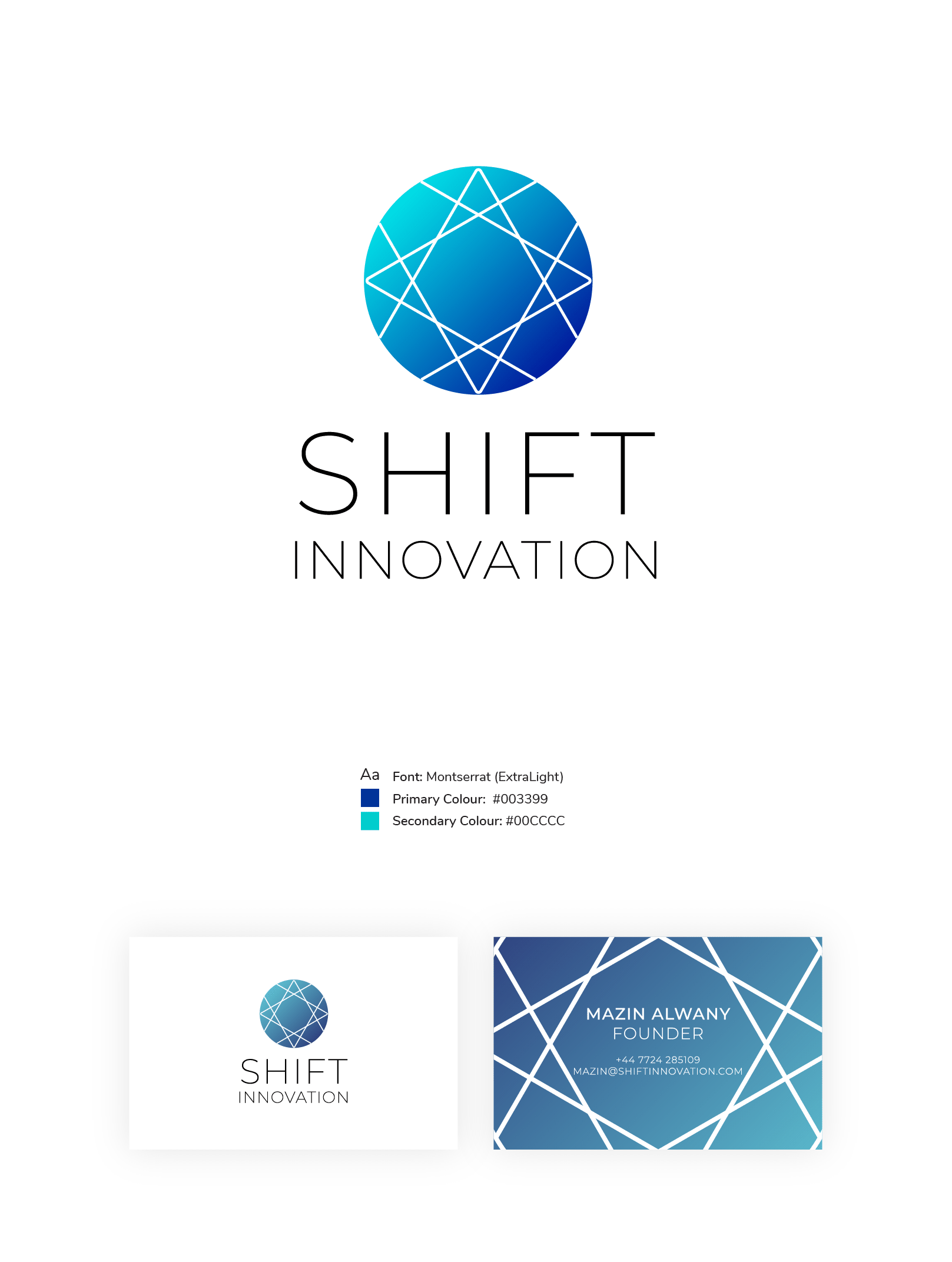
The logo is modern, with its minimal font and sleek thin lines and gradient colour scheme. However, it also has a slight geometric islamic/arabic art feature, in reference to the fact that the majority of their clients will be from the gulf and middle-eastern countries

Above show how I created the pattern within the circle, it is actually based around a square, with a circle inside edge to edge, and a triangle which slight extends further at 2 points. This was then shifted by a rotation of 90 degrees, so there's a total of 4 repeated shapes on top of each other rotated. Once I was happy with the icon I then played around with the font, and how I could further the idea of shift and movement in the logo.
In the end, the client chose the clean, straight and thin typography.
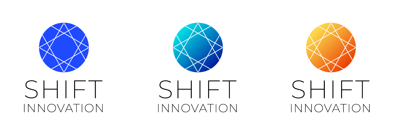
I presented the client with a flat block colour in a bright blue, or a few gradients choices appropriate to his education-focused consulting business
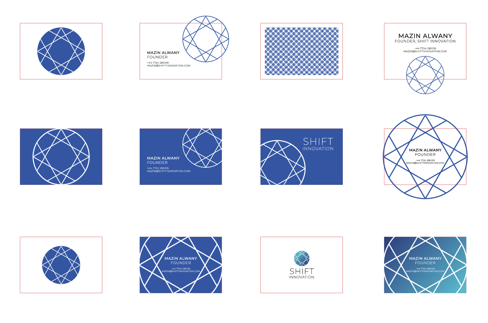
And above are different business cards concepts I created when playing with the logo, and how the icon could sit on the dimensions of the card