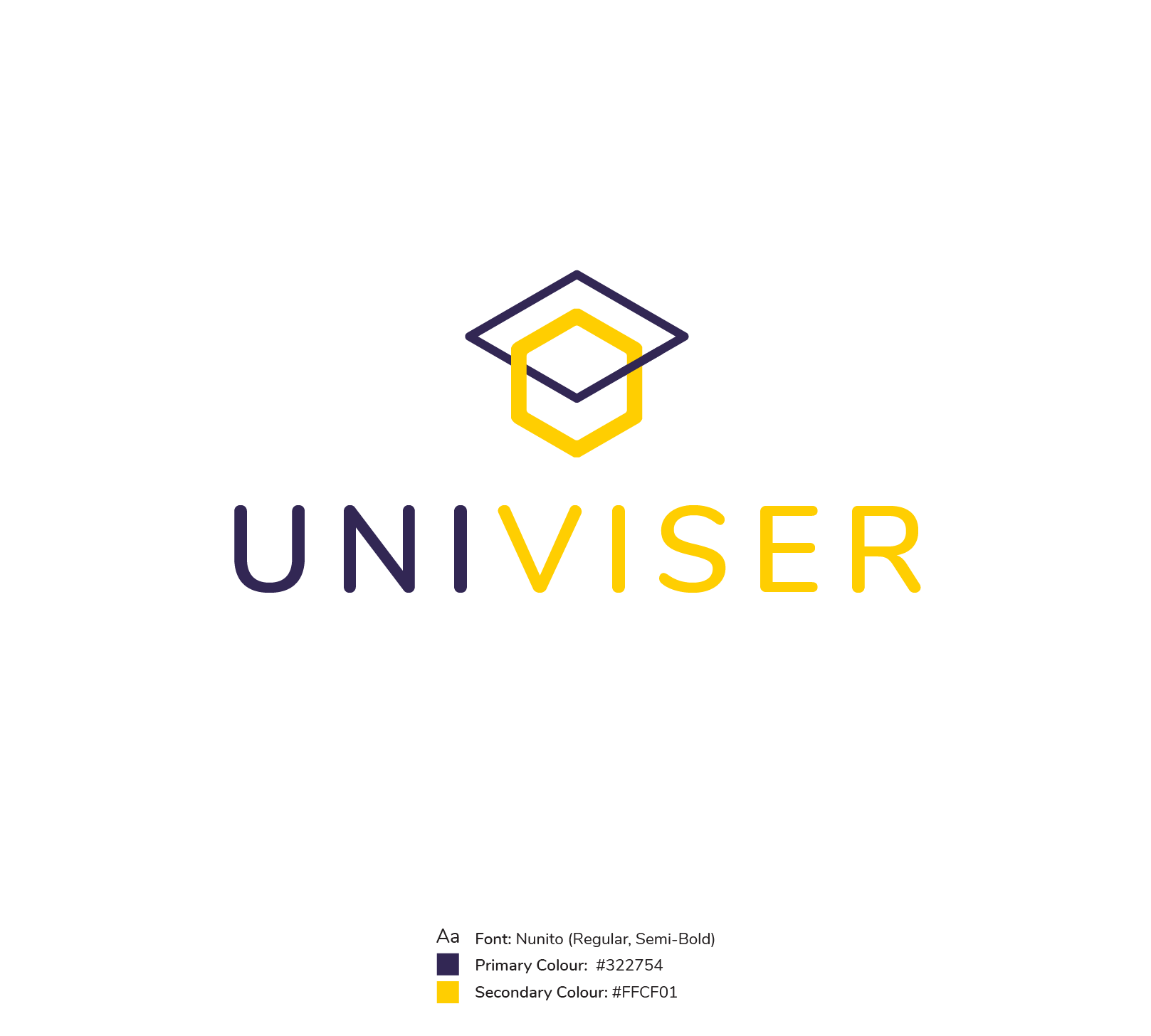
Branding Project: Univiser.io
A super-personalised P2P (peer-to-peer) platform connecting prospective students with current students from any course and university, globally.
Ismail Sadurdeen
Founder, Univiser
January 2019
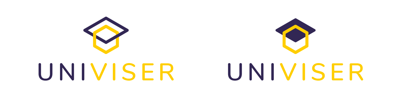
On the left is the icon for the main company, which is aimed at students, the icon on the right is for the future alumni capability
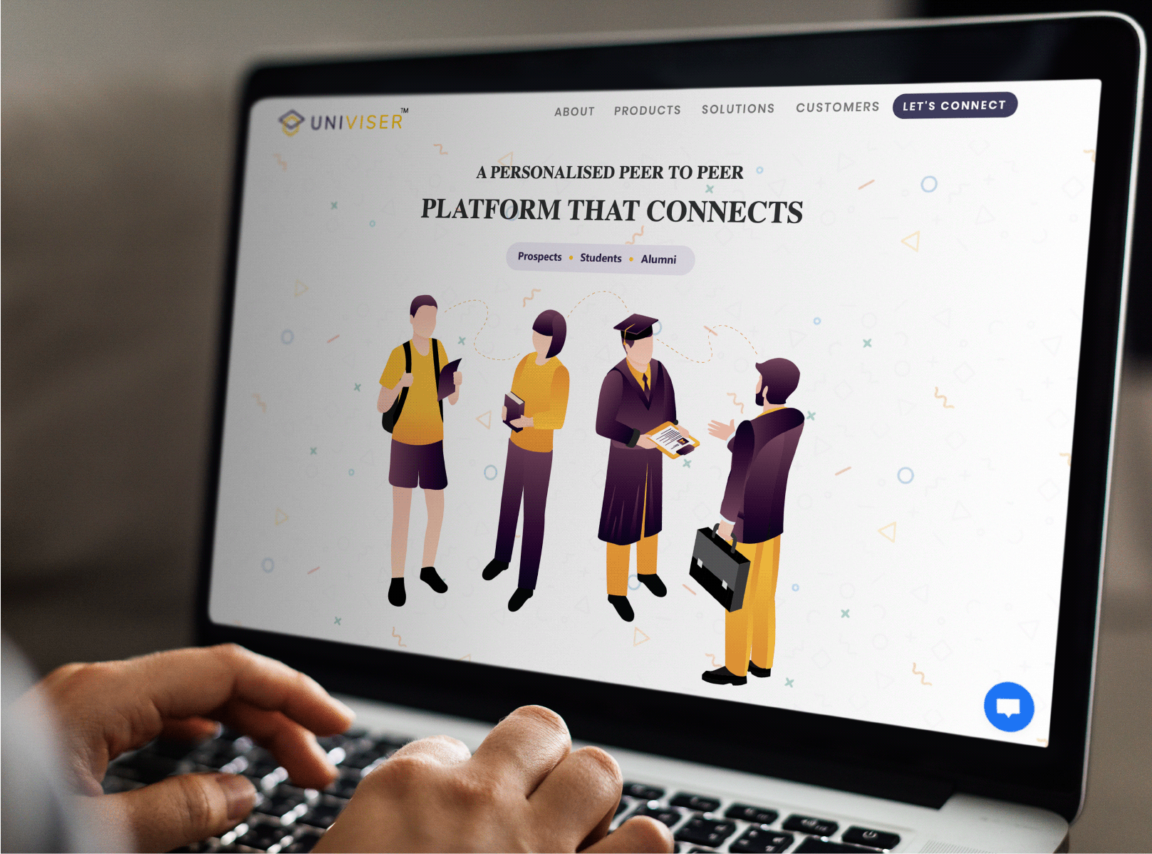
How the logo looks on the current website, where they've carried through the branding colour scheme and modern feel by using a plain abstract shapes background an on-trend digitally illustrated people
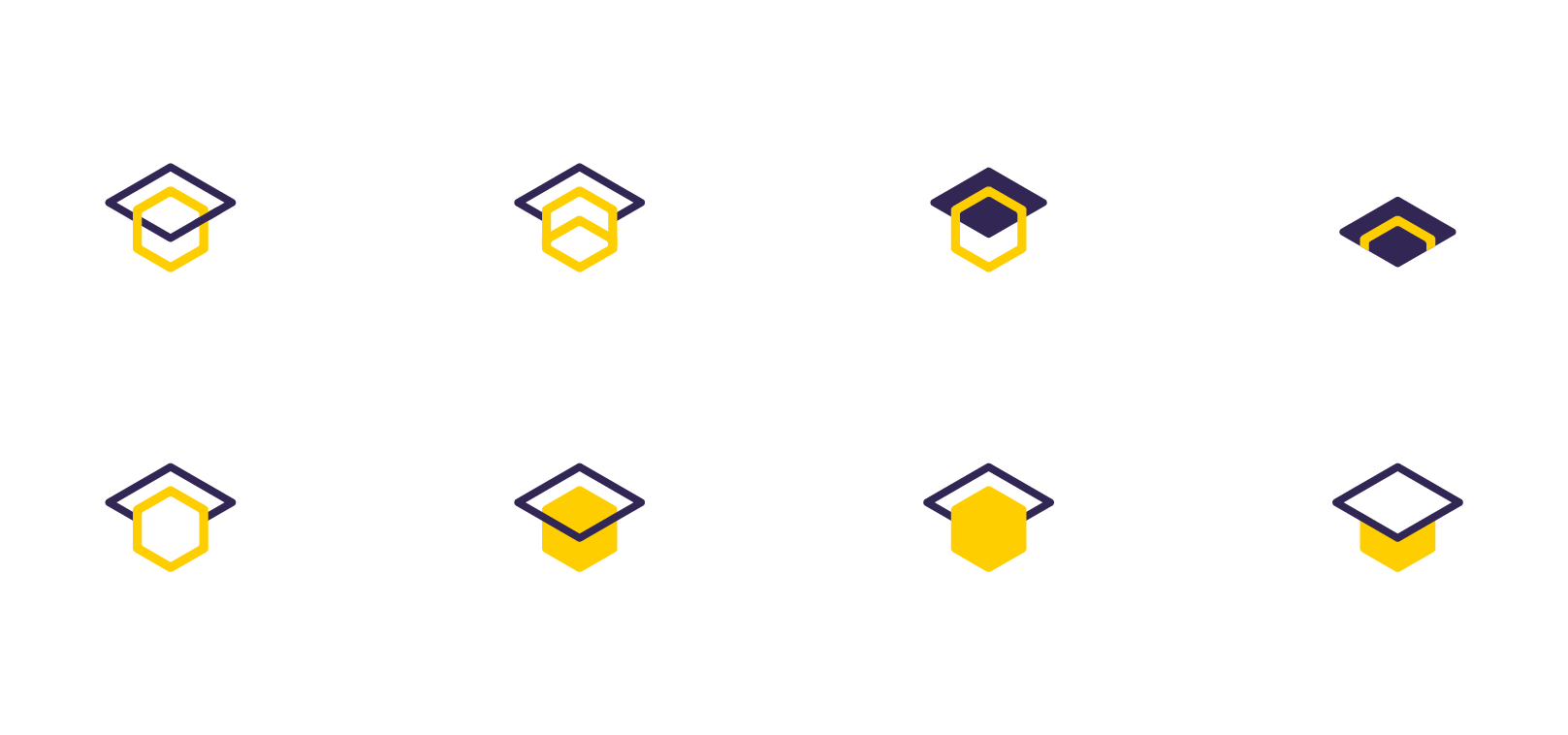
Before we reached the final icon, here are few of the exploration icons I created playing on the ideas of a graduation cap, networks, connection, community and being global
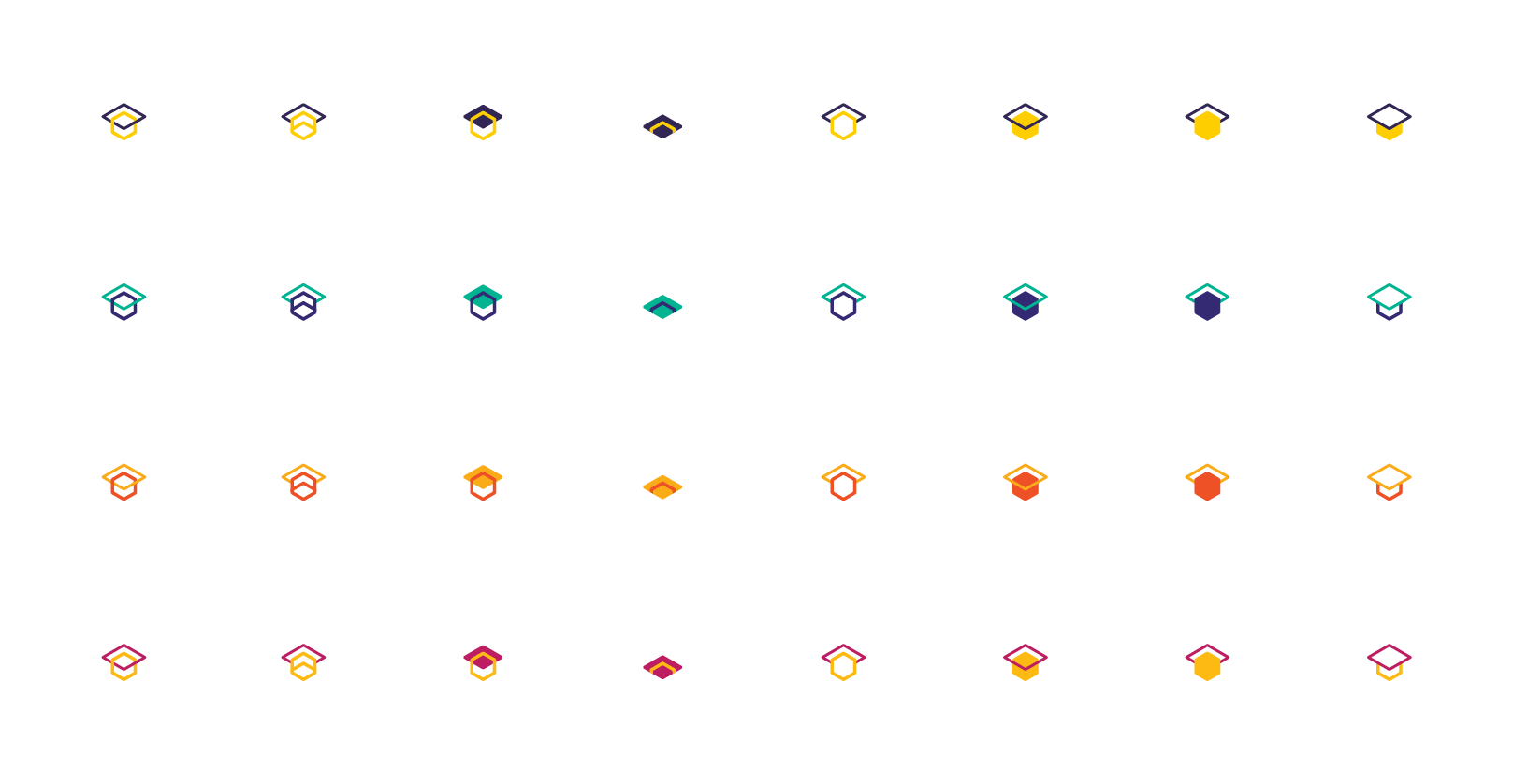
And above are multiple modern colour schemes which I ran past the client for his thoughts
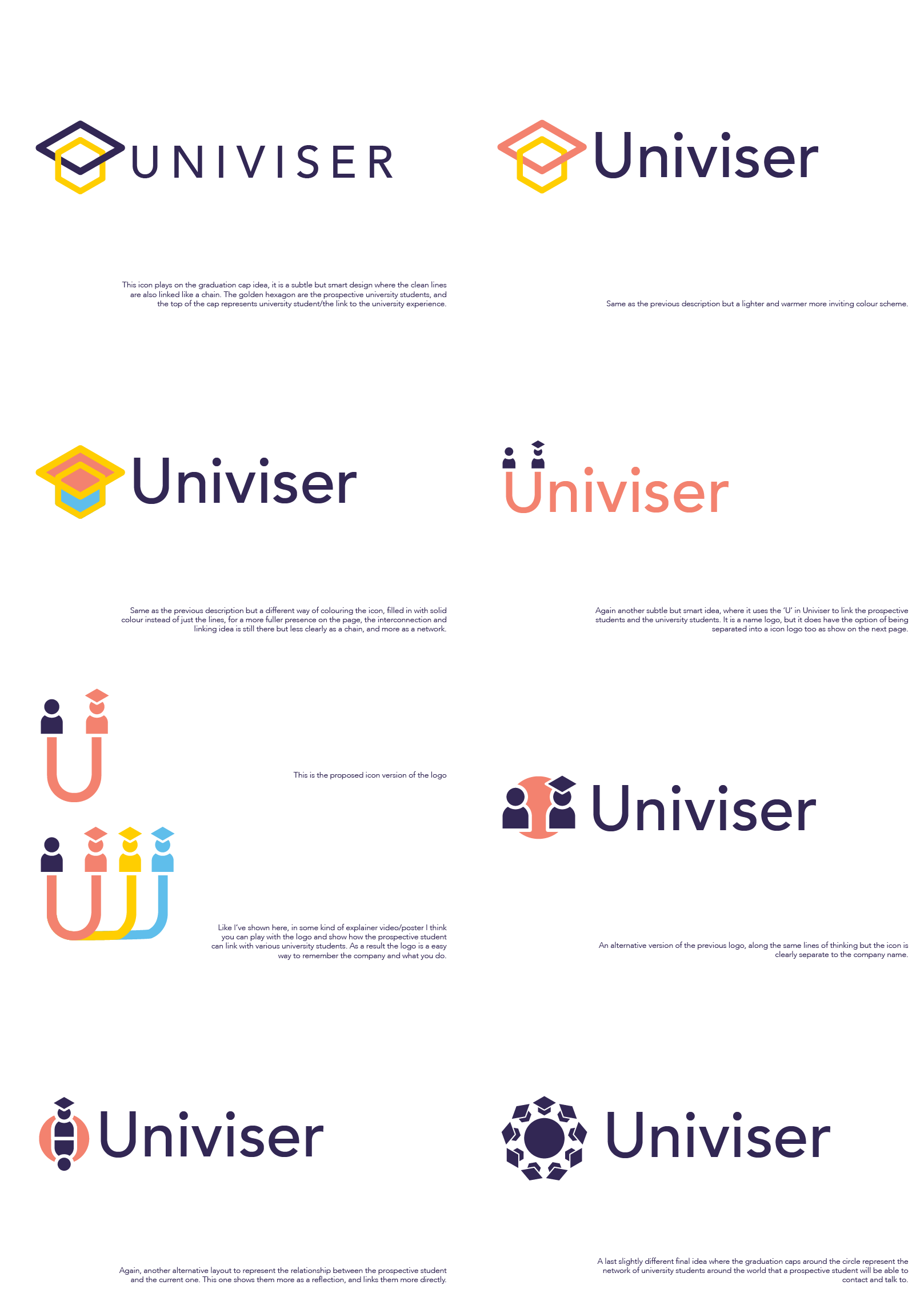
Lastly, here were the initial concept I explored with the client which played on different aspects of the brief which I understood from our initial meeting. He went for the more stripped back and abstracted icon logo for it's clean lines, bold colours, and layered meanings