Rebrand: Designing a new logo family for a growing Islamic Education Institution based in Walthamstow just on the edges of London in the UK
Ustadh. Hamid Mahmood
Fatima Elizabeth Trust
2019
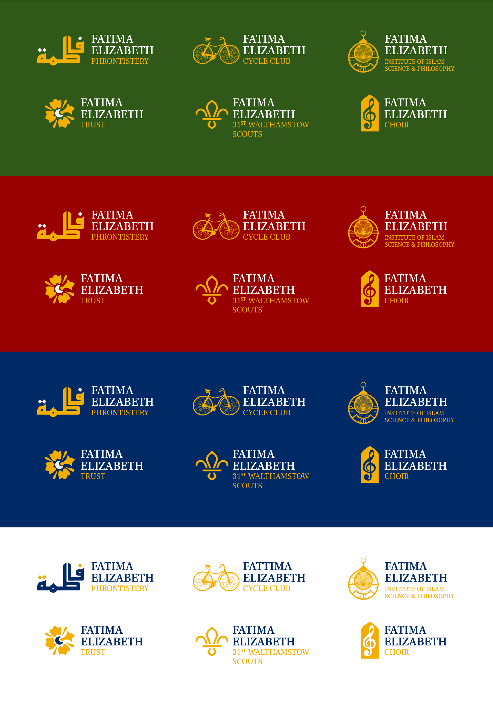
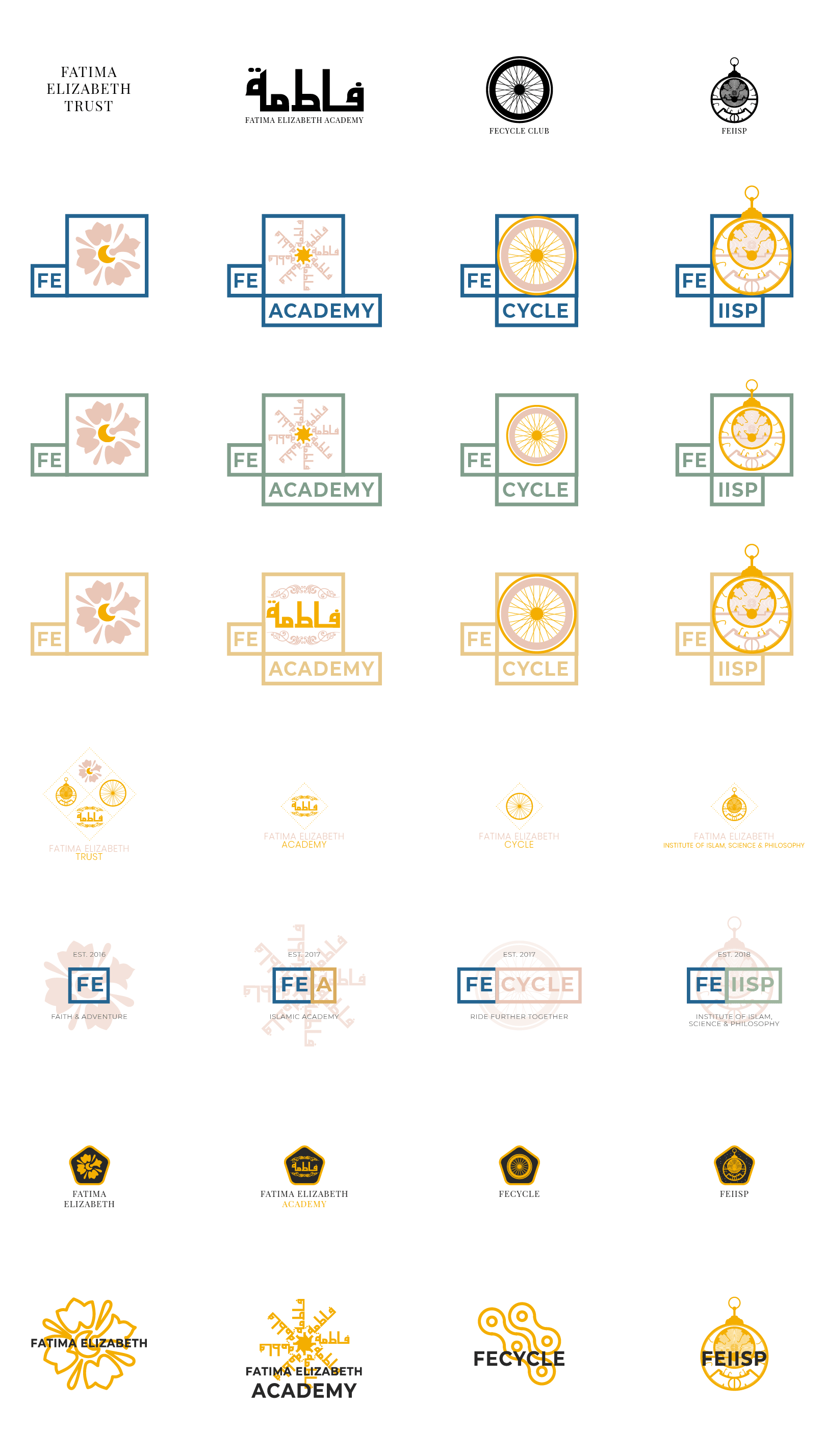
Initially, the organisation started as a weekend Islamic Supplementary School (Madrasa) for young children and was called Fatimah Elizabeth Cates Academy, but very quickly they realised the great positive effect they were having on the local muslim and wider community. One of their greatest successes was a cycle club which started as a way to encourage young girls as well as boys, to learn to cycle - this quickly grew into community wide cycle club which included the student's parents and surrounding community, even gaining attention and funding from the mayor of London. This being just one example, of one of the organisation's off-shoot projects which began to require their own identity, but unified under the Fatimah Elizabeth Cates body. In total the sub-organisations which needed a unified logo family were:
- Fatima Elizabeth Phrontistery (formerly named Fatimah Elizabeth Cates Academy)
- Fatima Elizabeth Cycle Club
- Fatima Elizabeth Institute of Islam, Science & Philosophy
- Fatima Elizabeth Trust
- Fatima Elizabeth 31st Walthamstow Scouts
- Fatima Elizabeth Choir (being formed soon)
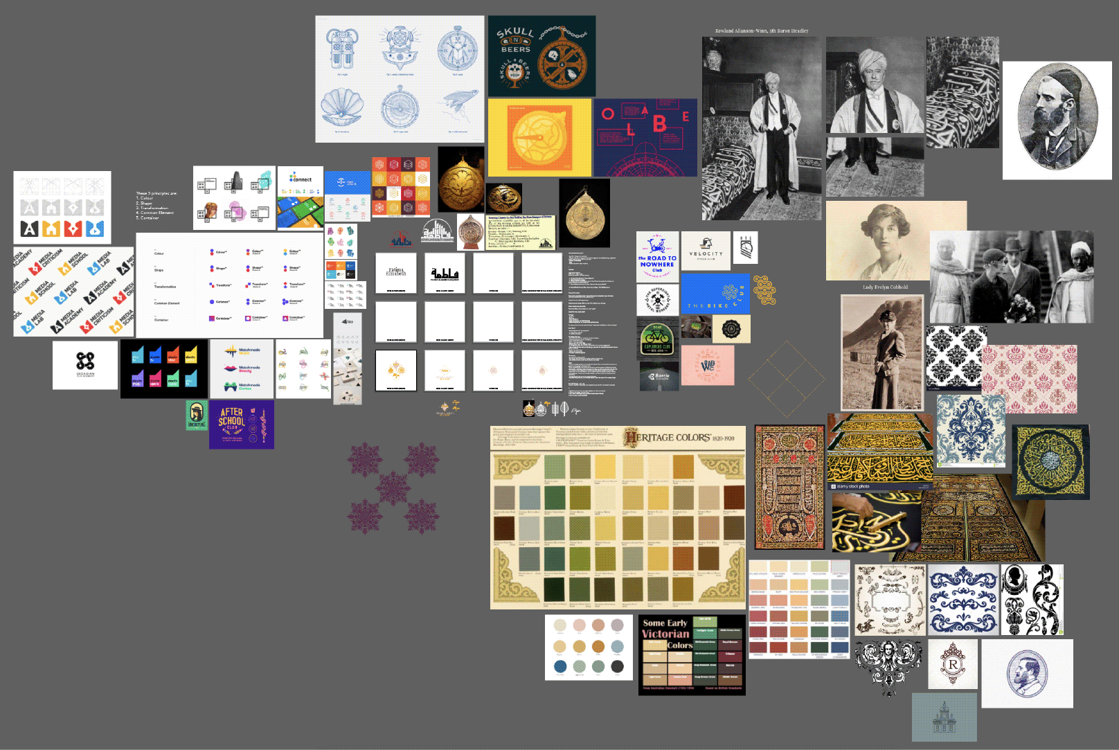
Working closely with Ustadh. Hamid Mahmood, the founder and CEO of the Fatima Elizabeth body, and his team of teachers and supporters, we quickly found a synergy and rhythm. Fatima Elizabeth Cates was the first British female convert to Islam in the Victorian times, and so it was chosen for the school to be named in her honour... and this name 'Fatima Elizabeth' perfectly encapsulates Ustadh. Hamid's intentions for the logo family, the mix of Victorian/English with Islam/Arabic. Therefore, in my initial research mood board I explored the following things:
- Examples of logo families, understanding what different methods designers use to have different logos whilst keeping a sense of unity
- Victorian patterns
- Victorian colour palettes
- Arabic calligraphy tapestries
- English Victorian Muslims, and their dress and decor
- Iconography related to cycling
- An astrolabe, a scientific measuring instrument of significance to the time and to Muslims as well
I then proceeded to brainstorm typography styles, icons and imagery for the respective organisations of the logo family:
The original logo for Fatimah Elizabeth Cates Academy had 'Fatimah' written in arabic, and Ustadh. Hamid requested to keep the arabic 'Fatimah' in the new logo.
For the umbrella trust body, I found a flower which was a small detail extracted in a simpler form from an old victorian pattern. I also drew up an astrolobe in vector format on Adobe Illustrator to manipulate for the FEIISP (Fatima Elizabeth Institute of Islam, Science & Philosophy) logo.
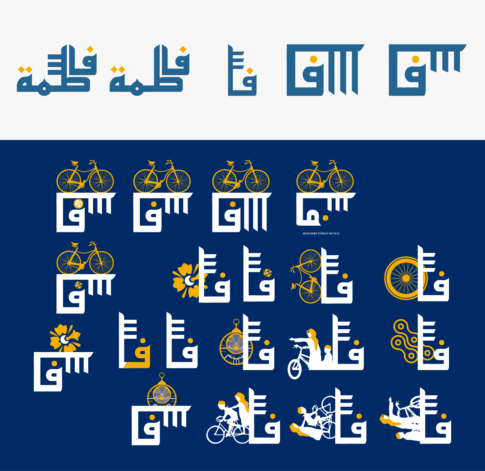
After I presented and discussed the first round of initial concept ideas to the Fatima Elizabeth Team, they wanted me to further explore the arabic of 'Fatima' - instead of keeping the form of the original logo... Also to see if I could incorporate Elizabeth, or 'E' into the form.
We also moved away from a lot of the more modern looking concepts, and looked to incorporate more history and meaning into the concept. So for example, we introduced a silhouette of one of the first few bikes created, which was manufactured in Walthamstow itself.
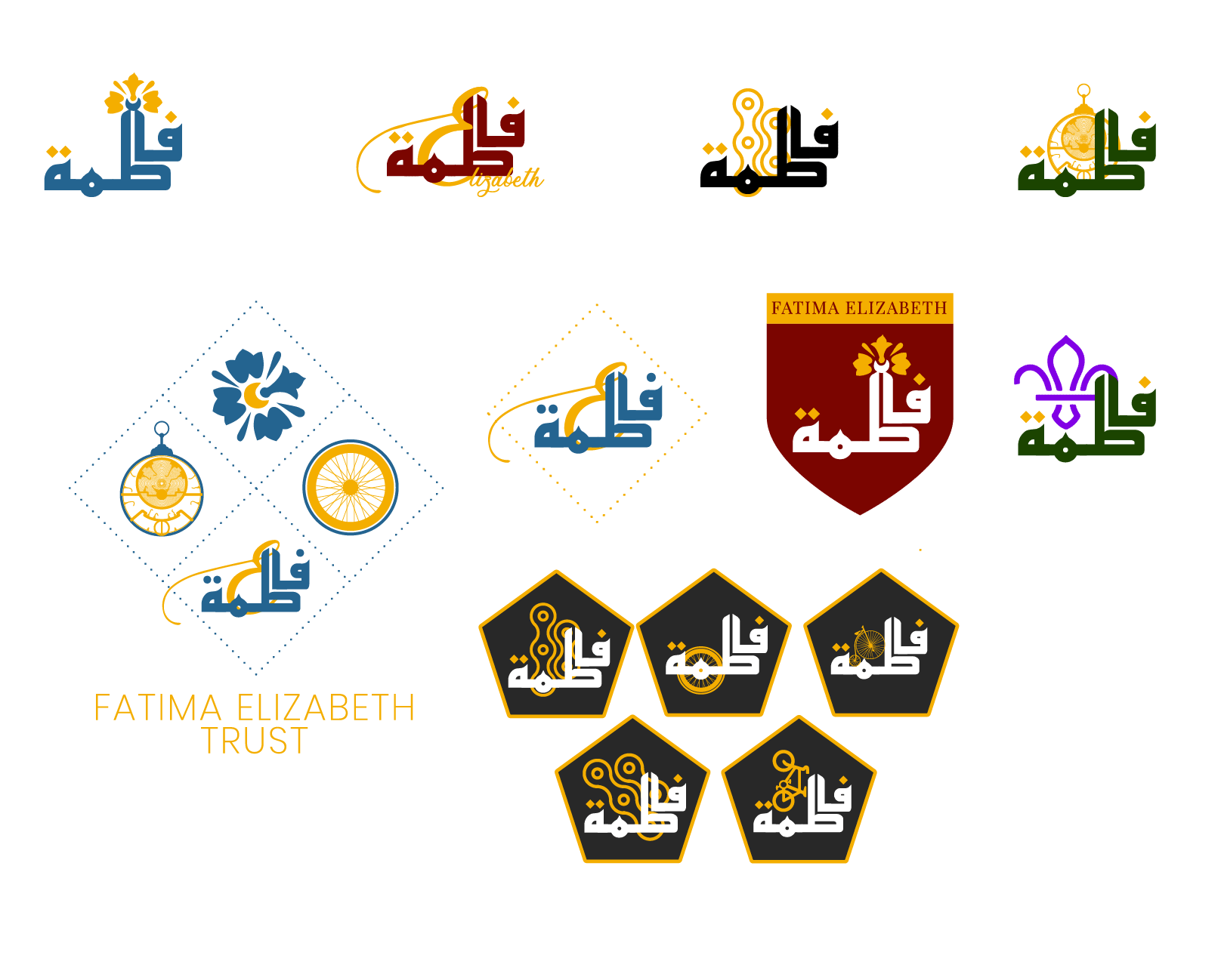
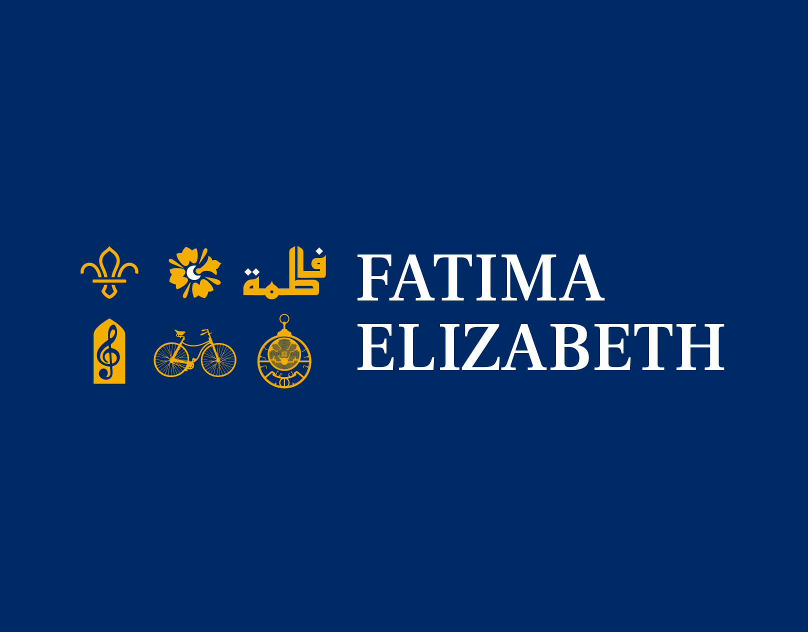
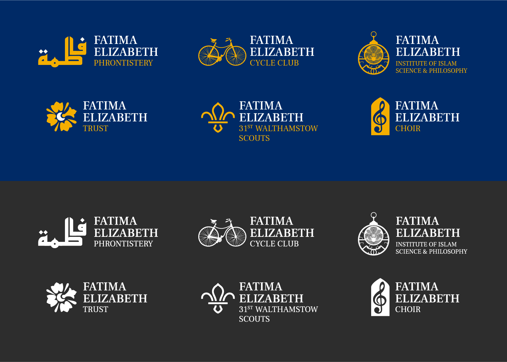
After a few final explorations into whether the team preferred the logos enclosed within a shape like a shield or hexagon, together we agreed on the simpler icon logos in empty space were more freeing. Finally we explored a few colour palettes, inspired from the Victorian and Islamic palettes discovered in the initial research.
After a final round vote with staff and students, the royal blue and gold colour palette was selected. It was an absolute pleasure and adventure working with Ustadh. Hamid and his team at Fatima Elizabeth, and I'm very grateful to have been brought onboard.